Mankipanki Daily
Case Studies

Abion — Brand Identity for Agro-Science Ecosystem

Project Overview

Abion is an agro-science and biotechnology brand representing a new beginning in sustainable agricultural development.
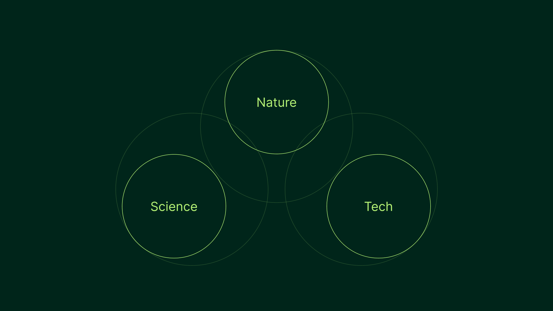
The goal was to create a visual identity for a company uniting nature, science, and technology into a single, coherent ecosystem.

Challenge

The challenge was to design a brand that feels foundational and forward-looking at the same time — expressing innovation without losing a sense of stability, trust, and biological authenticity.

Concept & Solution

Abion is built on the idea of synergy.
Nature provides the base, science offers understanding, and technology enables scale and efficiency.
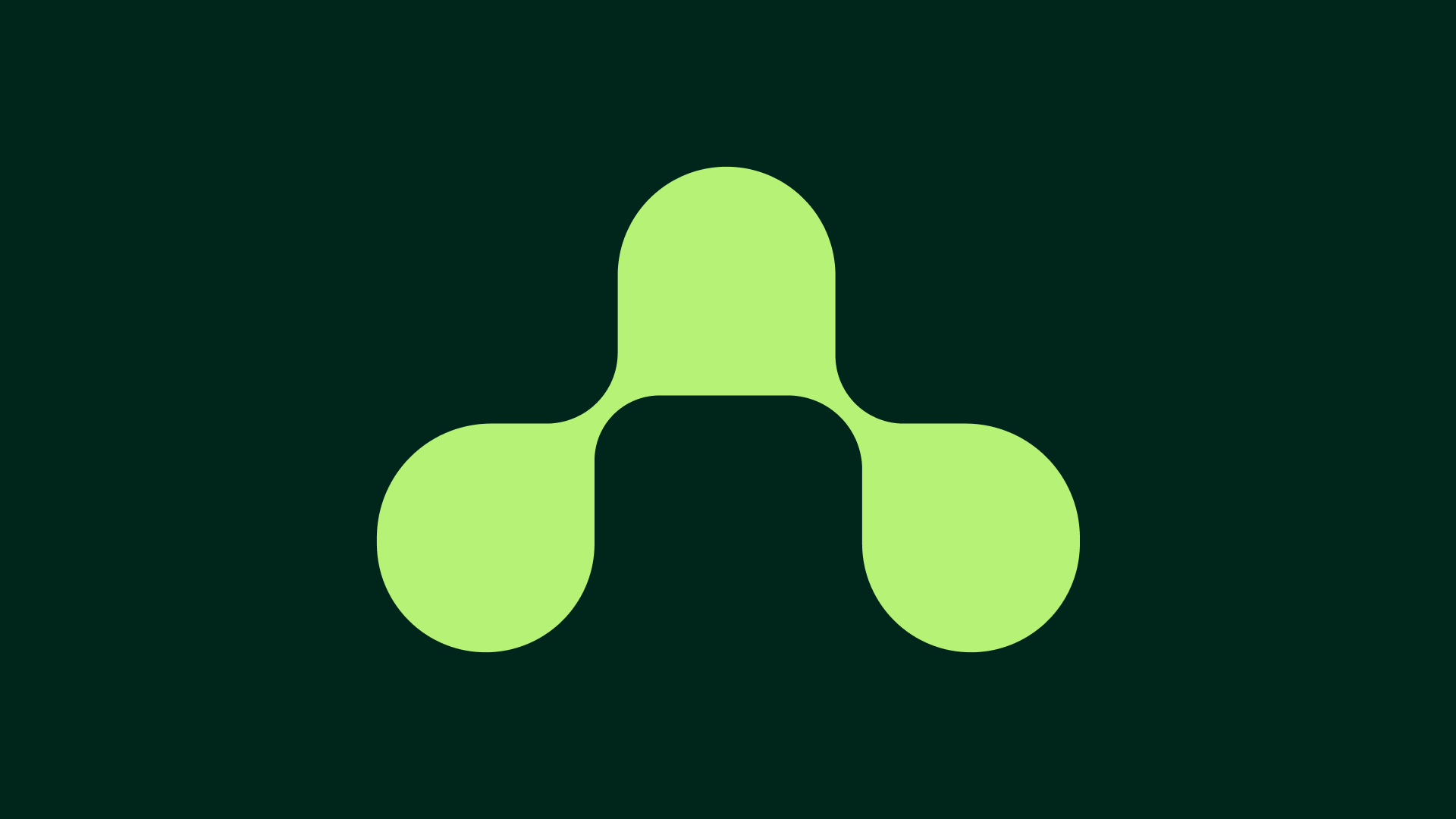
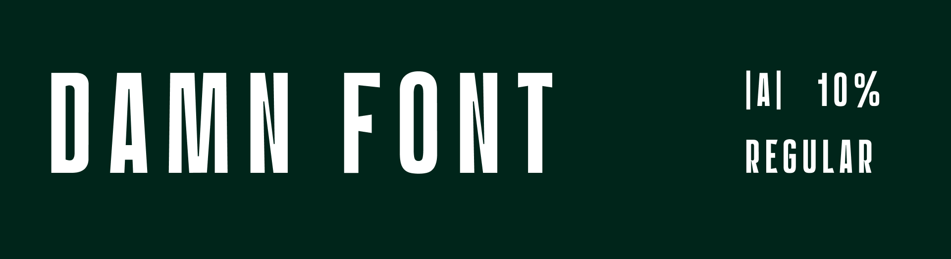
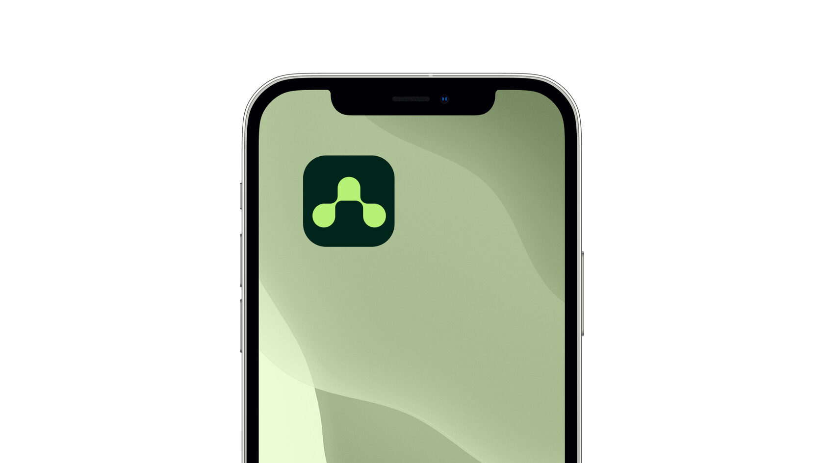
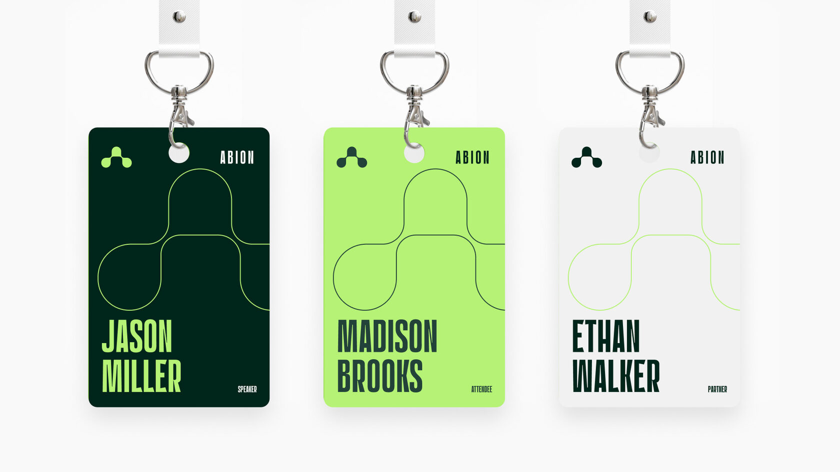
The logo is constructed around the letter A — the first letter of the alphabet and a universal symbol of beginnings. Its balanced, symmetrical form reflects biological systems and scientific structure without relying on literal imagery.
The identity communicates sustainable progress, systemic thinking, and long-term vision. Visual elements emphasize harmony, growth, and interconnected processes — positioning Abion as a modern agro-science brand designed for the future.
Diagram illustrating Abion brand concept based on the intersection of nature, science, and technology
The core idea behind Abion: nature, science, and technology forming a single interconnected system.
Abion agro-science logo symbol representing synergy and sustainable systems on dark green background
The Abion logo mark — a visual expression of balance, growth, and system thinking.
Abion logo and wordmark lockup for agro-science and biotechnology brand identity
Primary logo composition combining the symbol and the Abion wordmark.
DAMN typeface used in Abion brand identity for agro-science and biotechnology
Typography choice for Abion: structured, modern, and confident, reinforcing a scientific tone.
Abion brand color palette featuring neon green, dark noble green, and white
The Abion color system reflects science, agriculture, and technology in balance.
Abion mobile app icon design featuring the brand symbol on dark green background
Application icon using the Abion symbol in a compact, digital-ready format.
Abion event badges design for speakers, attendees, and partners
Branded badge system demonstrating flexibility across roles and formats.

Design Support: Mankipanki / Art Director: Iggy Kos / Designer: Kate Neray

Design subscription for product teams and marketing departments.
Need consistent design? Explore Mankipanki subscription.